En 2009, los artistas ingleses Rob y Nick Carter, instalaron afuera del Business Design Centre de Londres, un espectacular con luces de neón multicolores. Lo llamaron Read Colours Not Words [Lee colores no palabras], y consistía en seis filas de siete palabras; cada palabra, escrita en neón, denotaba un color (azul, amarillo, rojo, verde, morado, rosa, naranja) pero la luz que emanaba no estaba de acuerdo a la palabra escrita: la palabra naranja, por ejemplo, tenía un halo de luz azul. Read Colours Not Words podría entenderse como una síntesis del trabajo de los Carter hasta ese momento. El título era un manifiesto que sugería que el efecto de las palabras está subordinado al deslumbrante impacto del color –siempre crucial en el arte–. Desde 1997, los Carter han mantenido una constante investigación sobre las propiedades del color y la luz, innovando en fotografía, pintura e instalaciones lumínicas para crear experimentos cromáticos cada vez más intensos.
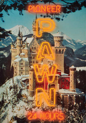
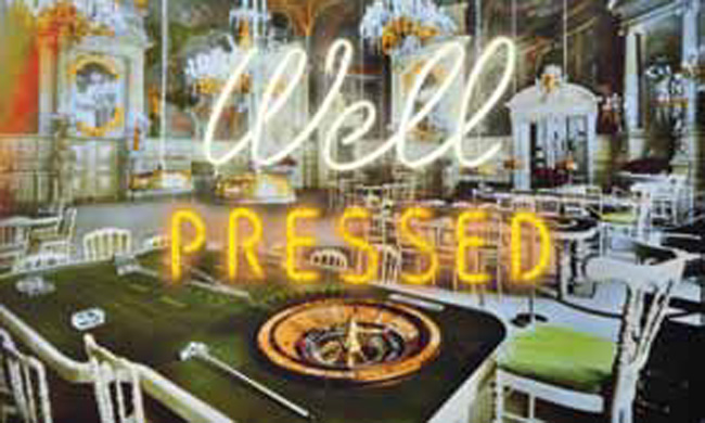
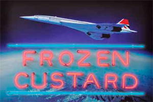
Colores puros y abstractos por encima de la figuración y la narrativa, ha sido el común denominador en su carrera artística, hasta Postcards from Vegas, su nueva exposición en la Fine Art Society de Londres, donde aunque el color se mantiene como parte esencial de la obra, la figuración y narrativa se convierten en sus ingredientes principales. Así, Postcards from Vegas, representa un paso importante en el desarrollo de la carrera artística de los Carter. La obra consiste en reproducciones ampliadas de postales viejas, montadas en aluminio, con la réplica de un cartel de neón original de Estados Unidos sobrepuesto. Los Carter crearon casi 150 combinaciones en computadora, pero sólo eligieron 14 para la exposición y los imprimieron en Cibachrome (proceso profesional de impresión), preservando el desgaste original de las postales. Todas las postales de Postcards from Vegas son complejos estudios sobre la imaginería de la nostalgia y de lo kitsch, y cómo se va construyendo. Aunque la obra se llama Postcards from Vegas, no son postales sobre la ciudad de La Vegas, sino símbolos de cómo nuestra memoria y deseos toman forma a partir de las imagines que constantemente nos rodean.
In 2009, the British artists Rob and Nick Carter installed a billboard embellished with multi- colored neon lights outside the Business Design Centre in London. Titled Read Colours Not Words, it consisted of six rows of seven words. Each word, spelled in neon, denoted a different color (blue, yellow, red, green, purple, pink, orange) but emanated light that was at odds with its meaning—orange, for instance, was surrounded by a soft penumbra of glowing blue. Read Colours Not Words could be understood as a distillation of the Carters' work to that point.
The title was a manifesto, suggesting that the effect of words is subordinate to the ravishing impact of irradiated color —which has always been crucial to their art. Since 1997 the Carters have repeatedly investigated the properties of color and light, innovating with photography, painting and light installations to create chromatic experiments of ever-increasing intensity. Privileging pure, abstract color over figurativeness and narrative has been the common denominator of their career, until Postcards from Vegas, their new exhibition at the Fine Art Society in London, where color remains as an essential part but, suddenly, figurativeness and narrative became the integral ingredients. As a result, Postcards from Vegas represents a significant way-mark in the Carters' artistic development.Postcards from Vegas consist of a blown-up reproduction of an old postcard mounted on aluminum and overlaid with a recreation of a real American neon signs. The Carters created around 150 combinations on a computer, yet only 14 made the final cut for the show and where printed using the professional Cibachrome process, preserving the original postcard's wear and tear. All Postcards from Vegas are complex studies in the imagery of nostalgia and kitsch, and how such imagery is constructed. These works are called Postcards from Vegas, but they are not postcards about Vegas— they are symbols of how our memories and desires are shaped by powerful visual imagery which we encounter in the world around us every day.
ADVERTISING
VIDEOS
FOLLOW US
SUSCRÍBETE
Conéctate con nosotros y recibe las noticias más recientes de nuestra publicación en internet e impresa.
Ingresa tus datos.
> Enviar
EDICIONES ANTERIORES
Consulta nuestras Revistas anteriores y disfruta lo que no pudiste leer.
EDICIÓN DIGITAL
La edición digital actual de nuestra revista impresa. > Ver más